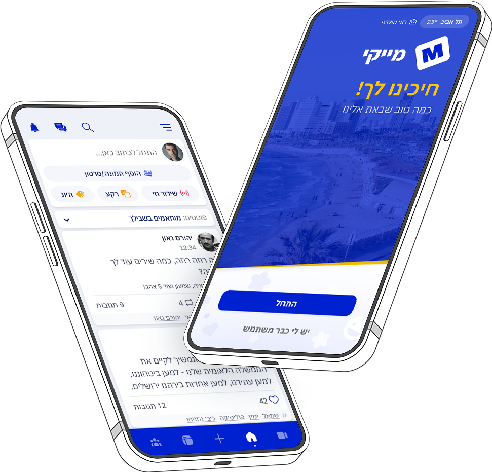

Mykey
Israeli social network that emphasizes the right to free speech and provides a platform for users to express their opinions and ideas in a politically correct world.
Mykey
Social Network
- User Experience (UX) Designer
- User Interface (UI) Designer
- One-on-one interviews
- Journey mappings
- High-fidelity mockups and prototypes
- UX Documentations and guidelines
Main Problem
Low signups, user engagement and retention.

25% signup/install rate.
16% of abandonments are at the OTP stage.
Project Goals
New onboarding experience.
Redesign of initial journey up to the main feed.
Personalized & user-friendly experience.
Enhance user retention and product loyalty.
Old Flow
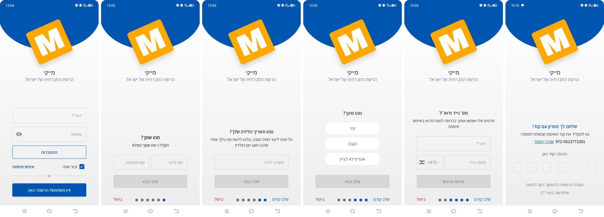
Observational Tests Revealed More
Task goal: Signup to the app and start browsing. Participants: 5
4/5 felt the signup was long.
2 people got confused with login/signup buttons.
2/5 were hesitant before entering both email and phone.
OTP doesn't fit industry standards - No SMS Retriever (Auto-paste code).
Instructions are small - People squinted their eyes/got phone closer.
People felt disappointed when they reached the feed. Lack of content discovery.
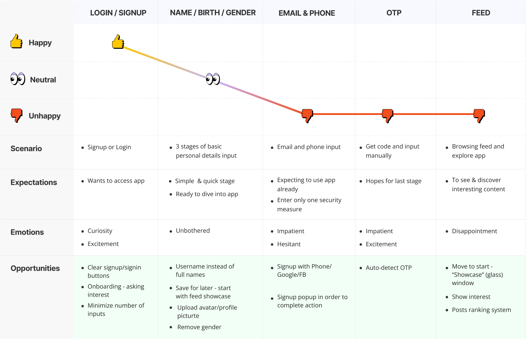
Discovering Flaws In The Journey
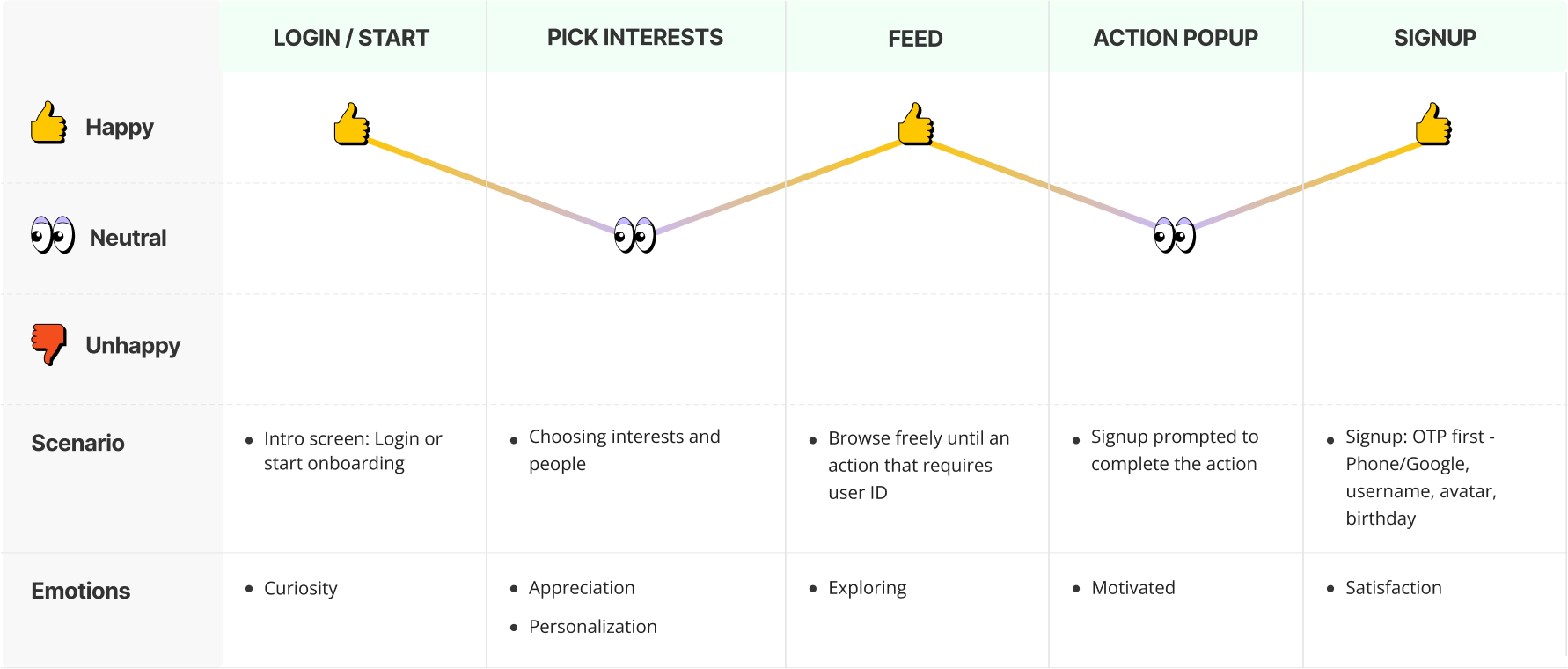
I'll choose to use a journey mapping method which will help me reveal the expectations and emotions of the users when they try to signup, and detect potential opportunities for improvements.
Israeli Warm
Hospitality
The new opportunities I discovered will help me to start and create a set of solutions to improve the signup/login and onboarding experience for Mykey users. These solutions are designed to remove barriers, improve functionality and trust, and provide a more personalized experience, making it easier to hop into the platform.
New Journey
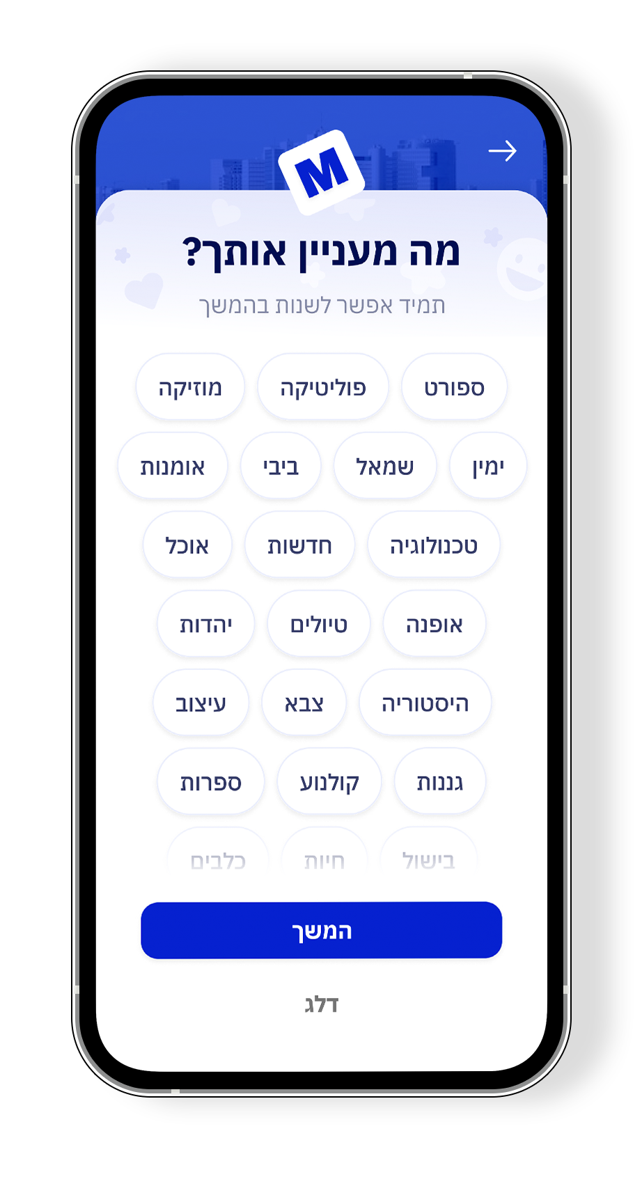
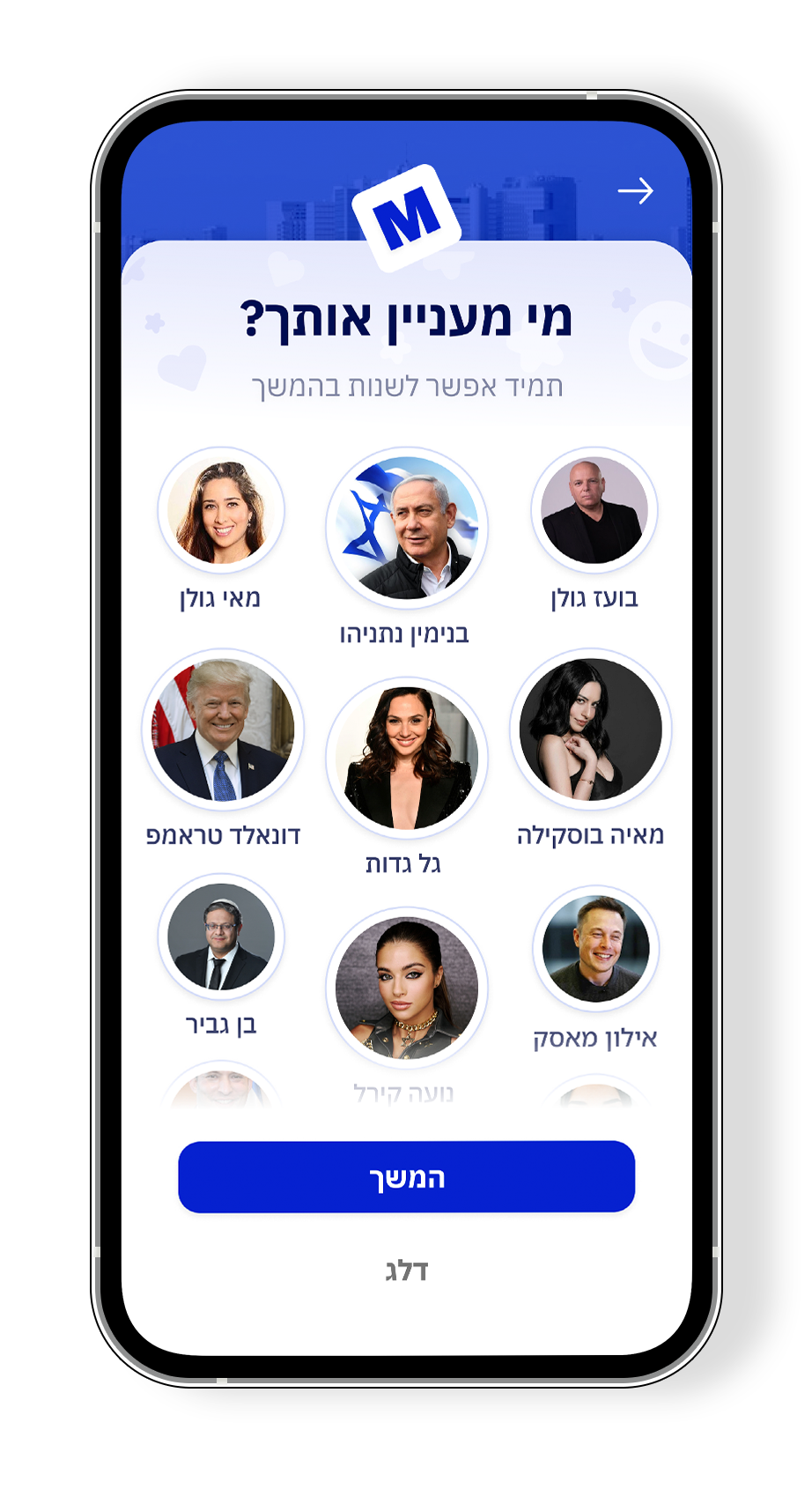
Ask Interests on Start - No More "Empty Party"
Asking users about their interests during the onboarding process has eliminated the 'empty party' effect, and added a sense of personalization to the users. Now, they can view recommended content that fits their interests.
 Choosing people
 Choosing interests
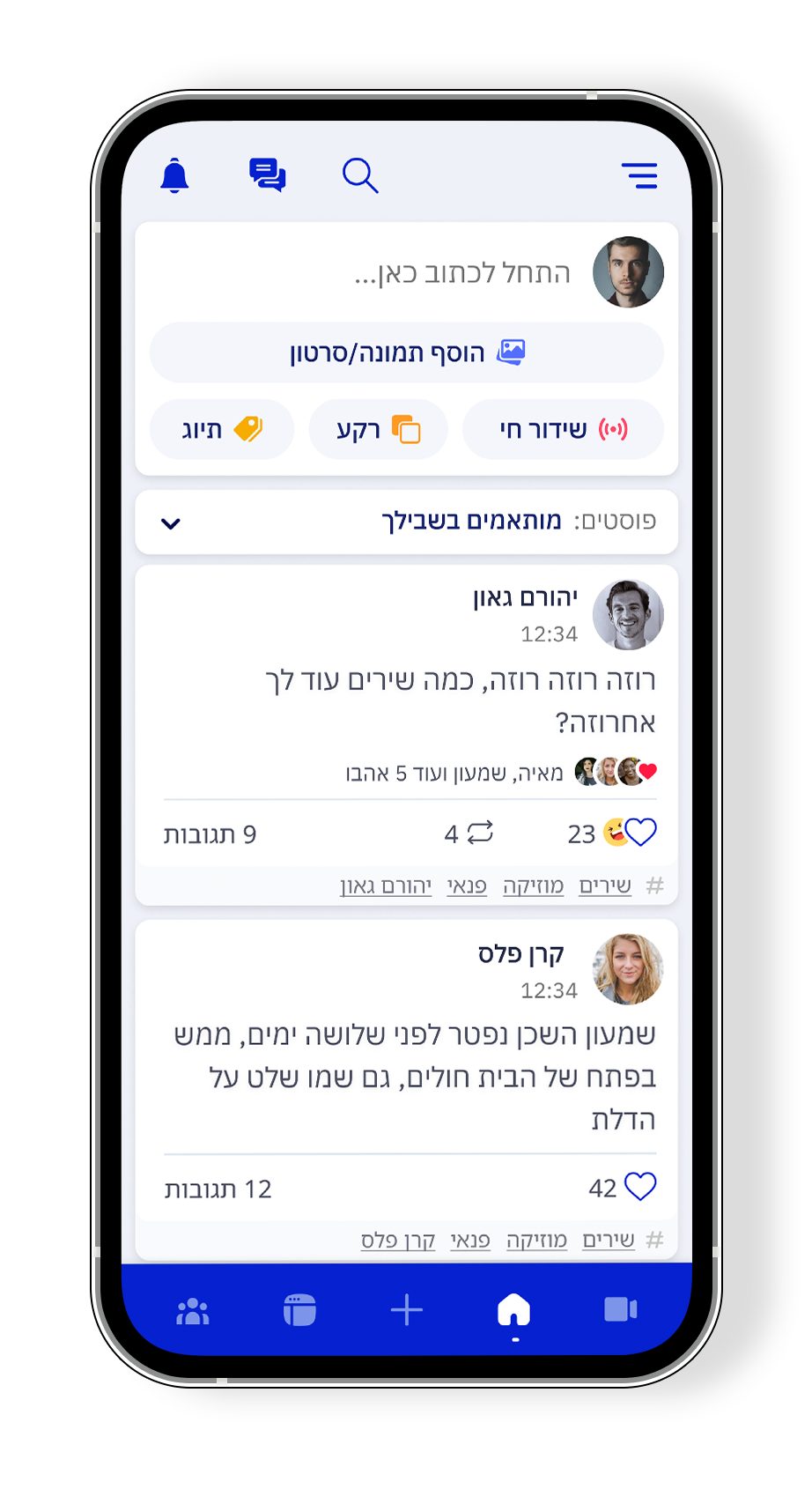 Step 1 - News Feed
Glass Window - Free Browse Pre-Signup
Once users have selected their interests, they can proceed to the news feed and browse the application freely until they wish to perform an action that requires personal information. At this point, they will be prompted to join the community. This way, we make users want to signup, by using the action as goal, and building trust by allowing them to explore the application before signing up.
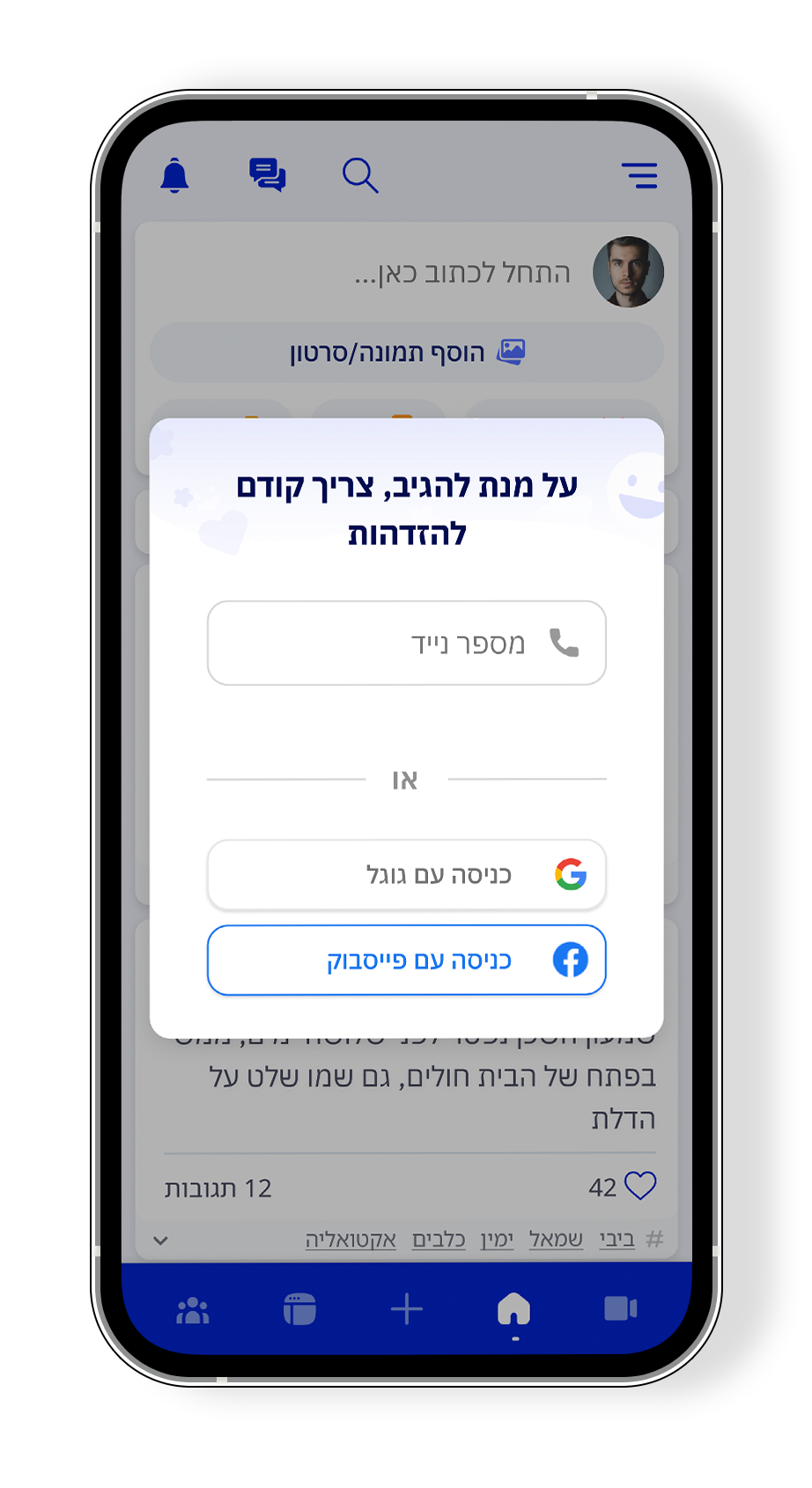 Step 2 - Action Prompt
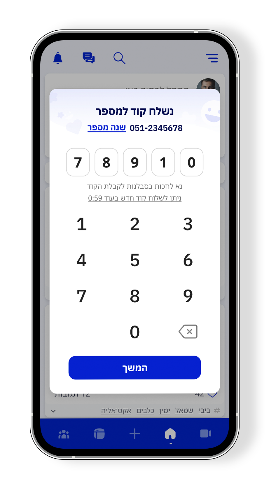 Step 3 - OTP
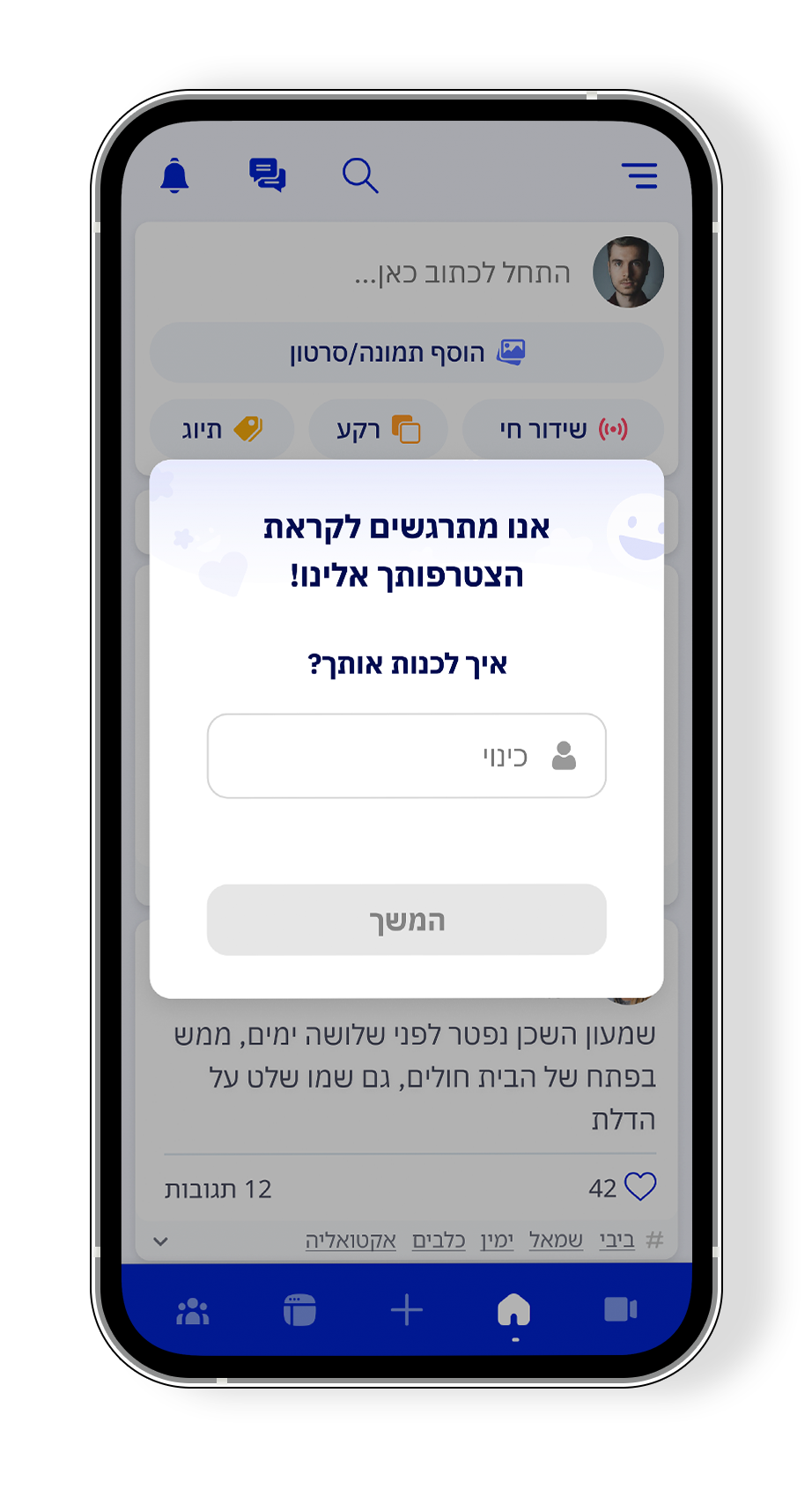 Step 4 - Name
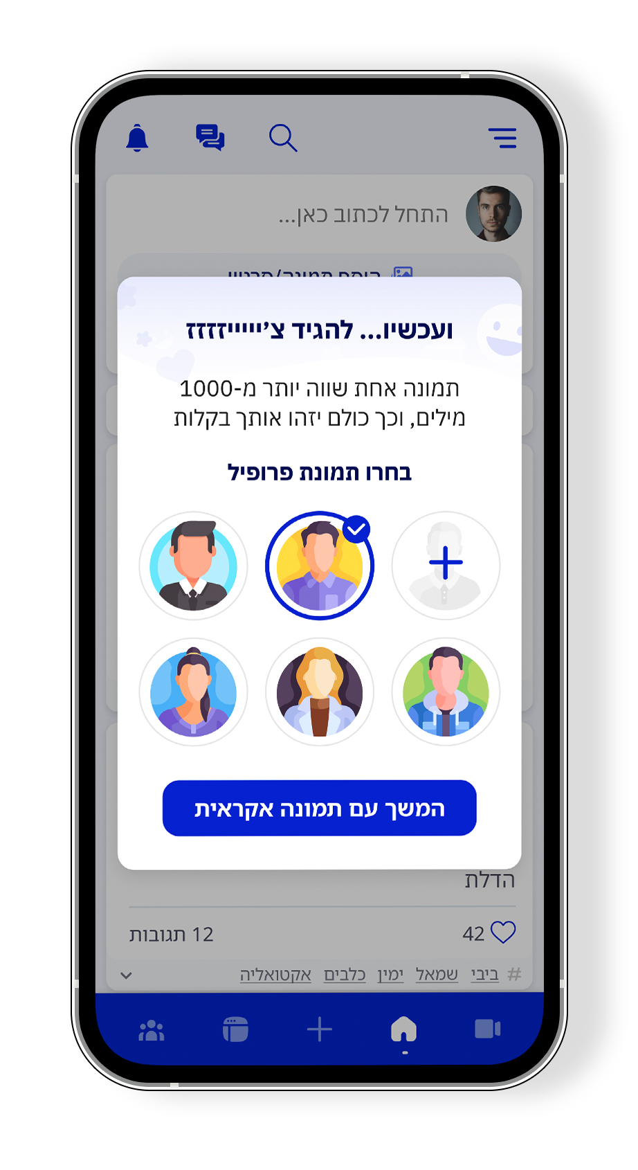 Step 5 - Profile Picture
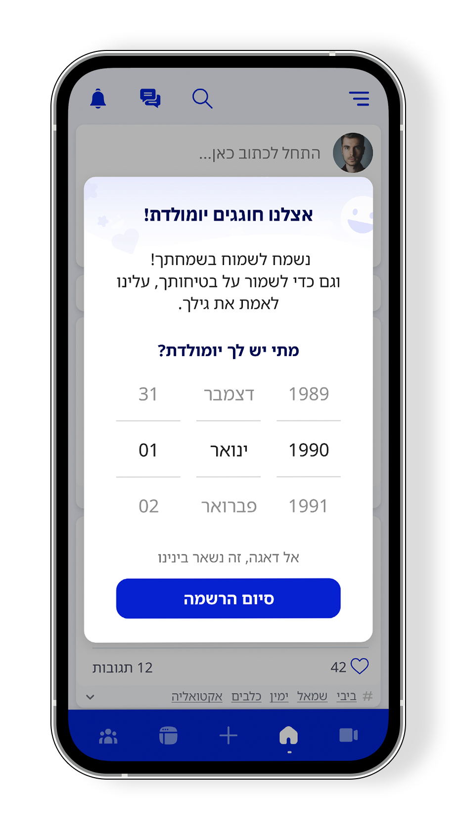 Step 6 - Birthday
Posts Ranking System
The Posts Ranking System solution involves implementing an algorithm that ranks posts in the user's feed based on their relevance and engagement. This will improve the overall user experience by providing them with content that is more likely to be of interest to them, thereby increasing engagement and retention.
Minimize Amount of Inputs & Personal Information Required
The solution to minimize the amount of personal inputs required involves reducing the number of mandatory fields during the sign-up process. This can help to streamline the registration process and make it less intimidating for new users who may be hesitant to provide too much personal information upfront.
Friendlier, Down-to-Earth Terminology
To make the app more user-friendly, I suggest using friendlier and down-to-earth language that is easier for all users to understand. This can create a more welcoming and comfortable atmosphere for users, ultimately improving user engagement and retention.
Improve Functionality (especially OTP)
More Specified Notifications
Prominent 'Create a Post'
Recommend People and/or Pages + External Sharing
What I changed and why it matters
Starting from a 25% signup rate and 16% drop-off at OTP, I redesigned the entire onboarding around three specific insights from user testing: the signup felt long, users hesitated to give personal data upfront, and the feed felt empty on arrival.
The redesign reversed the logic of the old flow. Instead of asking for commitment before showing value, users now pick interests, browse freely, and are only asked to sign up when they want to take an action. The OTP screen was fixed to support SMS auto-paste. The amount of required inputs was reduced. Language was made friendlier throughout.
What I'd measure if I shipped it: signup completion rate, OTP abandonment rate, and day-7 retention. These three metrics map directly to the three problems the research uncovered.
What I learned: Onboarding is not about collecting data — it's about building enough trust that users want to give it.